
Designer Roles
UI Design, Visual Design, Logo Design
The idea of design is to keep it simple and don't go for any trends. Keep it minimalistic.
Manmech Smart Pot App: UX/UI Case Study
This project focused on designing the mobile application for the "Manmech Smart Pot," an IoT device designed to automate plant watering and monitor water levels for home gardeners. My goal was to create an intuitive and visually appealing app that simplifies plant care and empowers users with valuable insights into their plants' health.
I. UX Design:
My UX process began with a deep dive into understanding the target audience: home gardeners of varying experience levels, including busy professionals, frequent travelers, and individuals with limited mobility. Through user interviews and competitive analysis of existing plant care apps and smart gardening solutions, I identified key user needs and pain points, such as forgetting to water, overwatering, and the desire for remote monitoring and notifications.
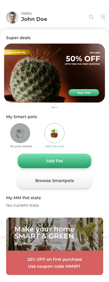
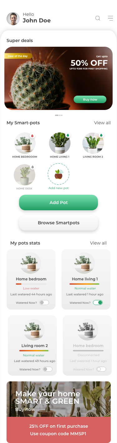
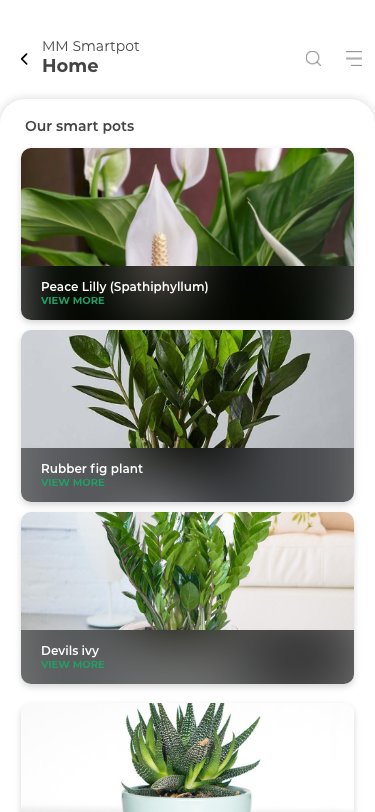
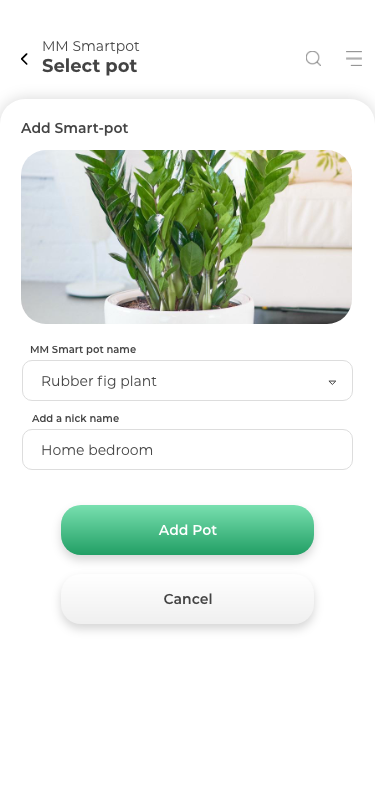
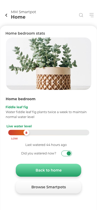
This research informed the app's information architecture. I structured the app into key sections: Dashboard (overview of plants), Plant Profile (detailed plant information), Watering Schedule (customizable schedules), Water Level (real-time monitoring), and Settings. User flows were meticulously mapped out to ensure seamless navigation and task completion, focusing on key actions like adding a new plant, setting a watering schedule, and checking water levels.
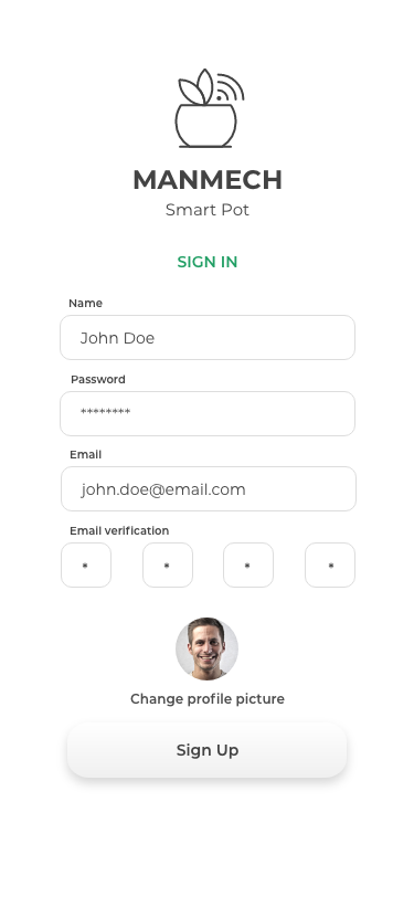
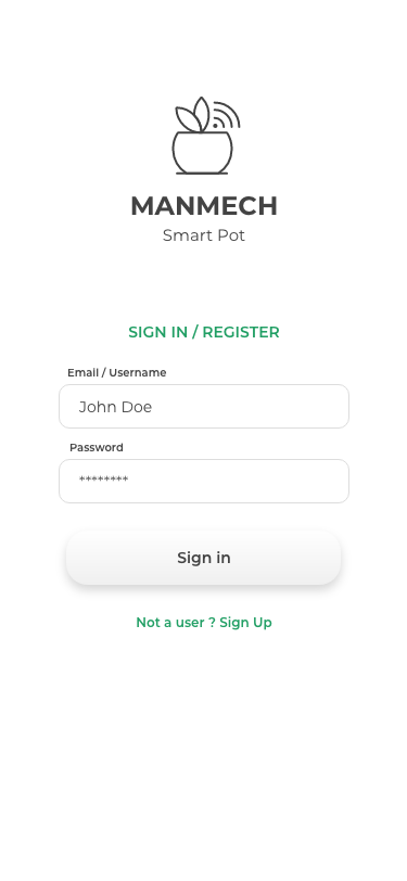
Low-fidelity wireframes were created for each screen, focusing on layout and functionality. These wireframes served as the foundation for an interactive prototype developed in Figma. This prototype allowed users to simulate the app experience, enabling valuable usability testing with representative users from the target audience. During these sessions, I observed user interactions and gathered feedback, identifying areas for improvement in navigation, clarity, and overall usability. The insights gained from these tests were then used to iterate on the wireframes and prototype, ensuring a user-centered design.
II. UI Design:
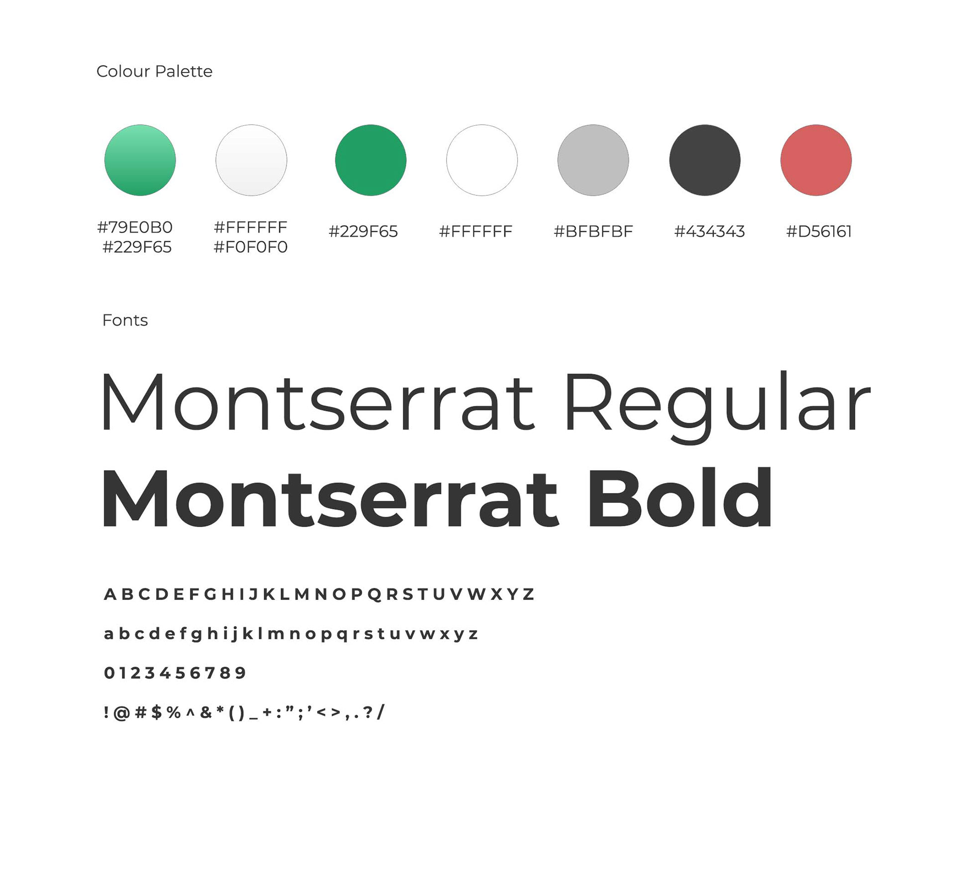
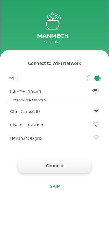
With a solid UX foundation in place, I transitioned to the UI design phase. A visual style guide was established, incorporating the "Manmech Smart Pot" brand identity. The chosen color palette of greens, whites, and greys evokes a sense of nature and tranquility, aligning perfectly with the app's purpose. Specific hex codes were defined for each color to maintain consistency throughout the design. Montserrat was selected as the primary typeface for its clean, modern aesthetic and excellent readability. Font weights and sizes were carefully chosen for different text elements, ensuring clear visual hierarchy.
I designed a set of intuitive and consistent icons, including a watering can for scheduling and a droplet for water level, further enhancing the user experience. Using Figma, Adobe Photoshop, and Adobe Illustrator, I designed each screen based on the finalized wireframes and prototype, applying the visual style guide consistently. Reusable UI components, such as buttons and form fields, were created to maintain design consistency and streamline the development process. Microinteractions, like loading animations and visual confirmations, were incorporated to add a touch of delight and enhance user engagement.
III. Design System & Handover:
To ensure design consistency and facilitate future updates, I created a comprehensive design system documenting all UI elements, styles, and guidelines. This design system served as a valuable resource for the development team. Detailed design specifications, including asset files, color codes, font sizes, and spacing guidelines, were prepared for a seamless handover to the developers.
IV. Post-Launch Considerations:
While this case study focuses on the design process, I recognize the importance of post-launch iteration. User feedback gathered through app store reviews, surveys, and in-app feedback mechanisms, along with app usage and performance data, will be crucial for identifying areas for improvement and further refining the app's UX and UI.
This project highlights my ability to combine user-centered design principles with a strong understanding of visual design to create effective and engaging mobile applications. I am confident that the "Manmech Smart Pot" app will empower users to effortlessly care for their plants and enjoy the benefits of smart gardening.
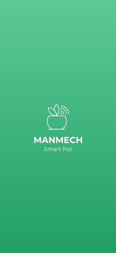
The Logo was also a requirement along with the UI Screens. We implemented a simple logo which easily represents the idea of a smart pot.
Eventhough its a simple one we actually did implemented most of the components which the products are provided.
Finally all the attributes get matched in a perfect way that even the logo is enough explanatory to understand the product really well.
Thanks for reading
Peace